Let’s dive right in!
WHAT IS A COLOR TREND?
Color trends and forecasts can either highlight a popular shade that is gradually building a cult following, or it can mirror the overall feeling back to us, pointing us in the direction we’re heading. These colors influence a wide variety of industries, from fashion to graphic design, packaging to home decor.
Popular and iconic colors can speak for a generation, and you know it when you see it. Think: Avocado Green in the ’70’s, Emerald Green, Teal and Peach in the ’80’s, or Millenial Pink over the past few years.
WHO CHOOSES THE COLOR OF THE YEAR?
Typically, Pantone, who is considered the “global color authority”, or the Color Marketing Group, both select a color or palette based on current culture. For home interiors, we like to go one step further and see what the paint brands like Benjamin Moore or Farrow & Ball have to say.
Branding wizards, color experts and paint manufacturers from around the globe have been working for months, thinking about the current state of the world, the economy and the overall morale to determine which colors reflect the sentiment of how we want to feel at home.
WHAT IS THE COLOR OF THE YEAR FOR 2021?
After much thought, collaborative consideration, and a look to the future, we have been presented with a handful of down to earth and dependable colors to choose from. (That sounds like what we’re looking for, especially after the year we’ve had, amirite?)
2020 was all about home – staying home or walking around in nature, Earth as Home. So naturally, the influence of the familiar is taking us into the next color phase in design. Take a look at the variety of color predictions below and see which colors resonate with you. And keep scrolling for more inspiration on how to put everything together and how we’ve used these colors in our interior designs projects over the years.
DRUMROLL PLEASE….
Pantone
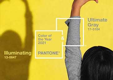
Ultimate Gray + Illuminating
Ultimate Gray and Illuminating show us how contrasting shades can work together in a complimentary way, reflecting our need for both strength and stability along with sunny optimism.
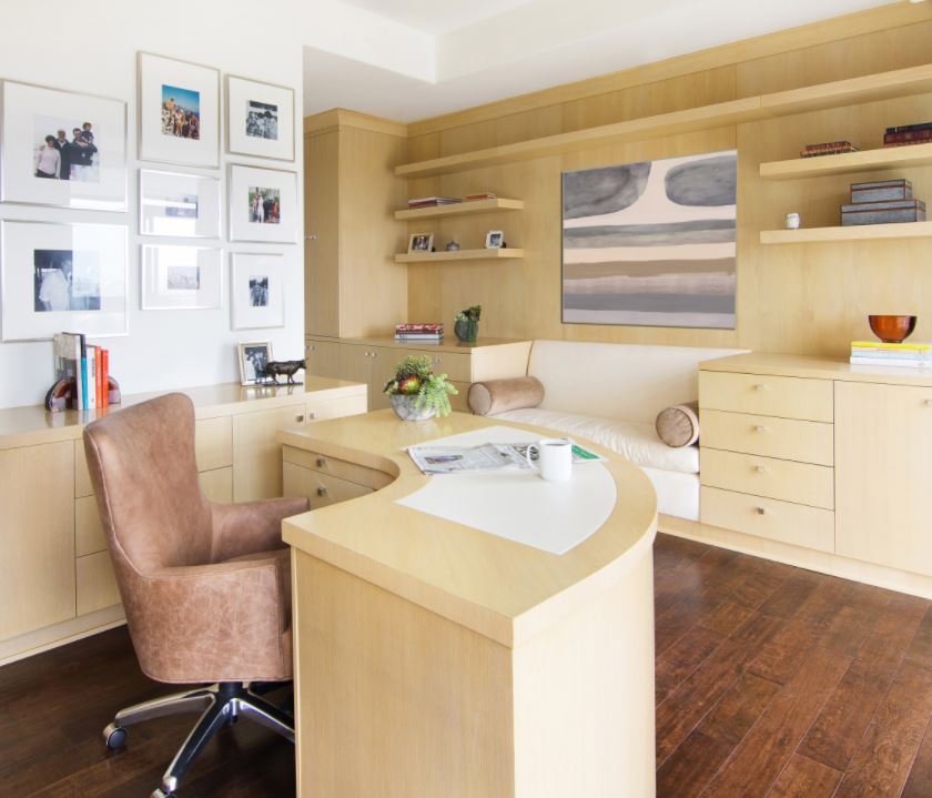
Each color works great alone, but even better paired together. For example, use Ultimate Gray as a go-to neutral on Walls and Furniture, and accent Illuminating in Hardware and Lighting Fixtures, Accessories or as Blonde Cabinetry.
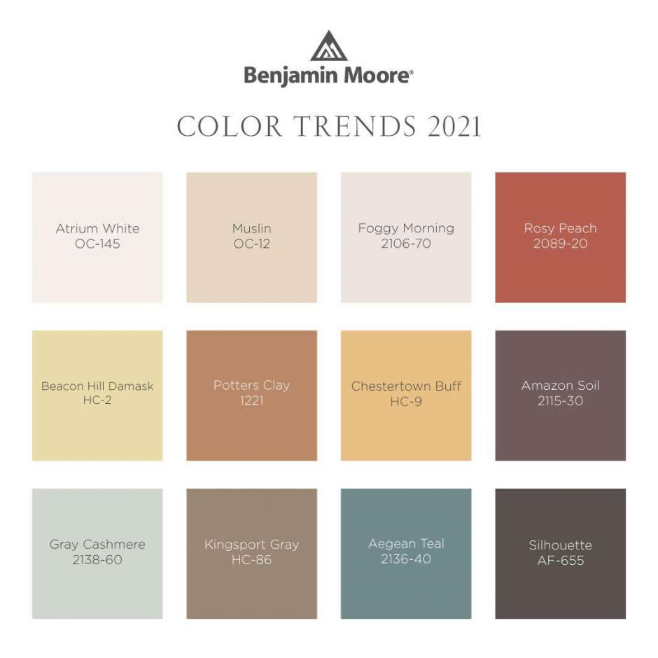
Benjamin Moore
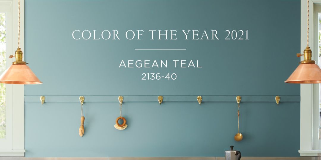
Aegean Teal
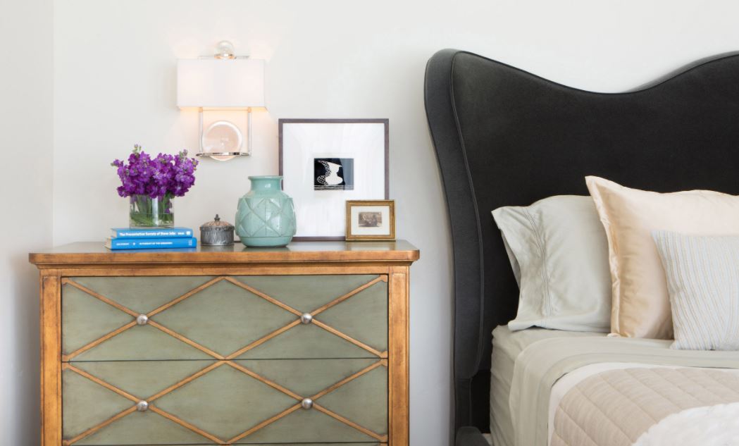
Aegean Teal is an absolutely beautiful organic blue green with chalky grey undertones that feels simple, soothing and oh so comfortable – just what we’ve been longing for. What’s great about this color is that it pairs well with both cool and warm colors.
Add this muted teal to walls in any room, like a bedroom or bathroom, or try on Kitchen Cabinets, Wallpaper, Bedding, Drapery and Accessories.
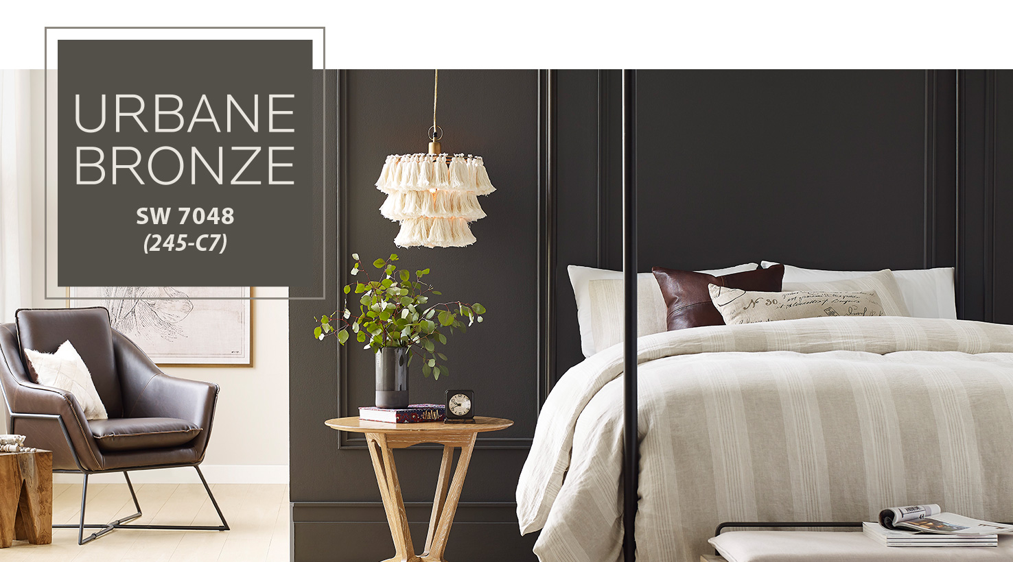
Urban Bronze
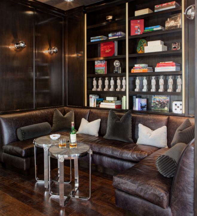
Urban Bronze is grounding, and a sharp contrast to the bright whites we’ve been seeing over the past few years. Warm, down-to-earth and sophisticated, this rich color brings an authentic tone to any room.
Add depth to your space by painting walls and millwork in the same shade, or introduce this color as Metal and Stone Material Finishes, Trim and Furniture.
PPG
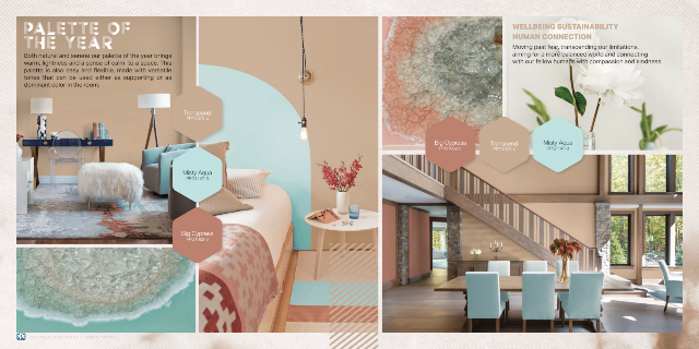
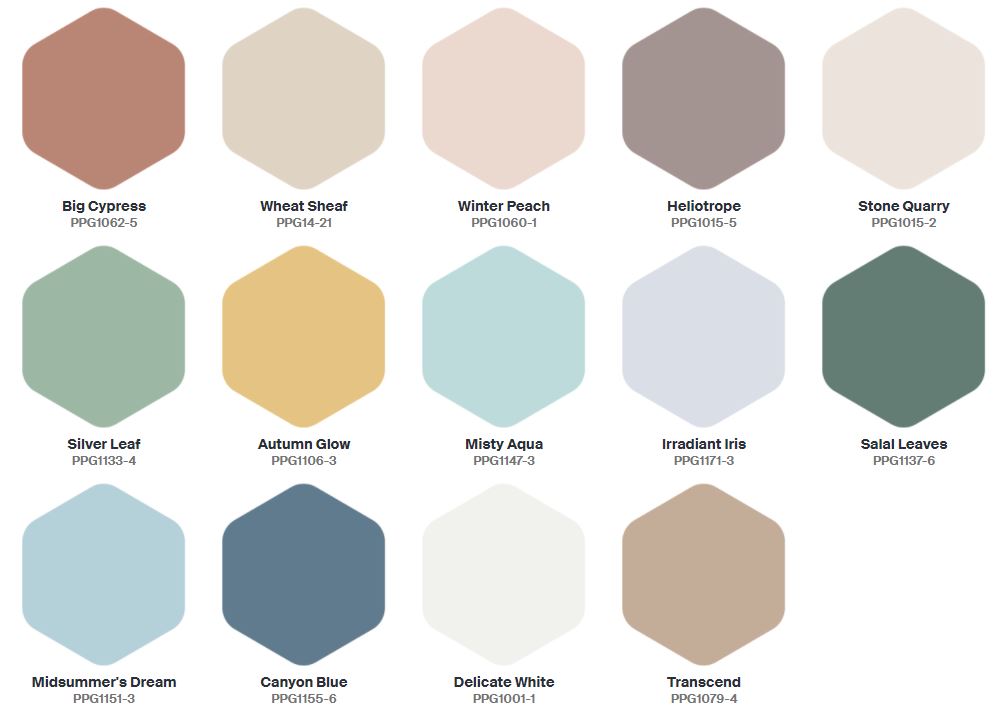
Transcend, Misty Aqua & Big Cypress
This color combination has us feeling those nostalgic neutrals that give us a sense of calm and comfort, like an easy day at the beach. It’s fresh, familiar and focused on wellness. As we’ve been longing for less stimulation and more simplicity, you can’t get any more organic than this palette.
Mix and match these shades on Upholstered and Casegood Furniture, Material Finishes and Walls. You can’t go wrong.
Farrow & Ball
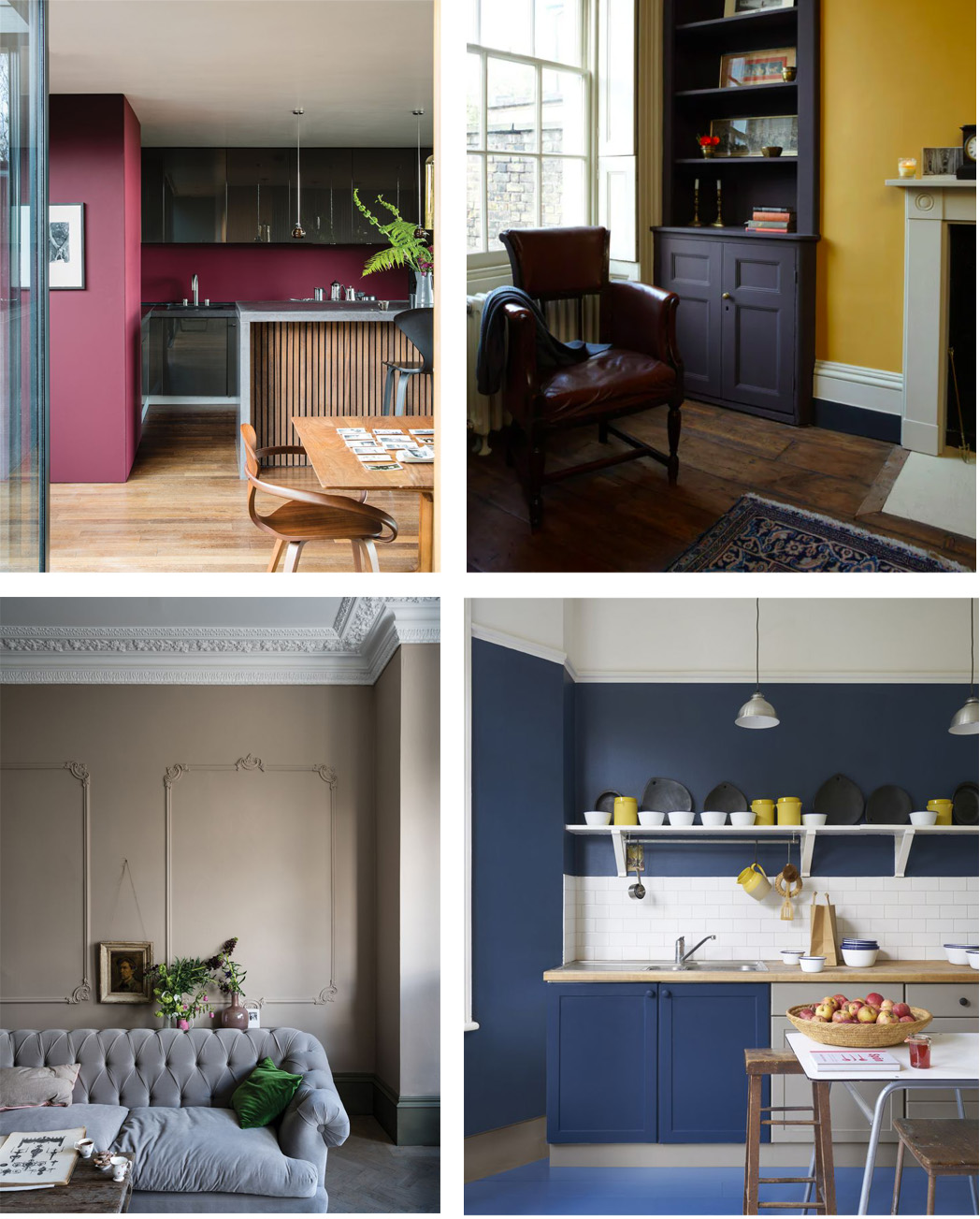
Preference Red, Jitney, India Yellow, Stiffkey Blue and Sap Green
Never one to be subtle, Britain brand Farrow & Ball has selected a bolder collection of earthy primary colors that add a touch more luxury and flair to a room. Rich, chic and utterly familiar, this take on the basics feels grounded and elevated all at once.
Select one pop of color to make a statement in any room, or try it on Kitchen Cabinets, Upholstered Furniture and Accents like Pillows and Bedding.
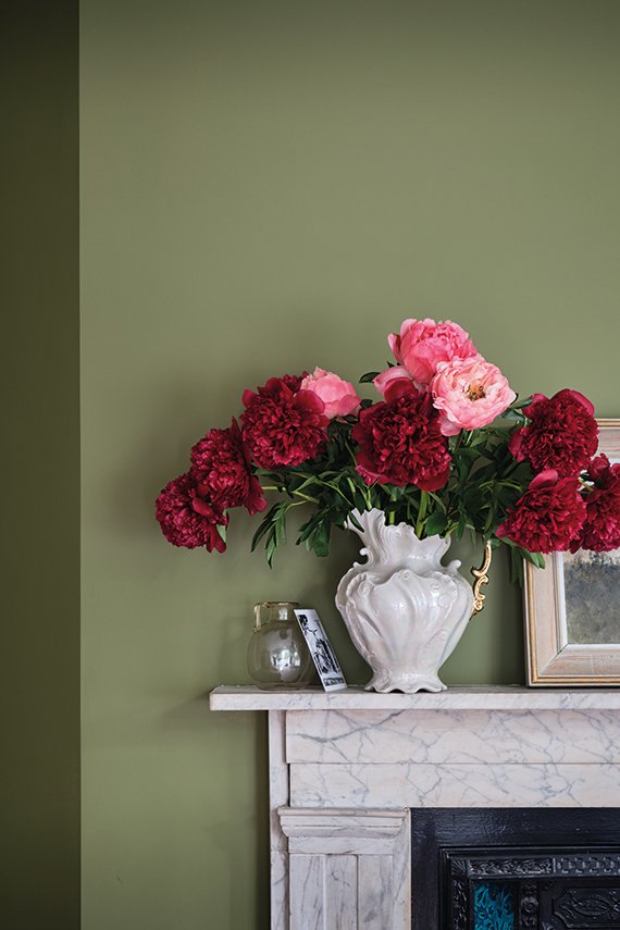
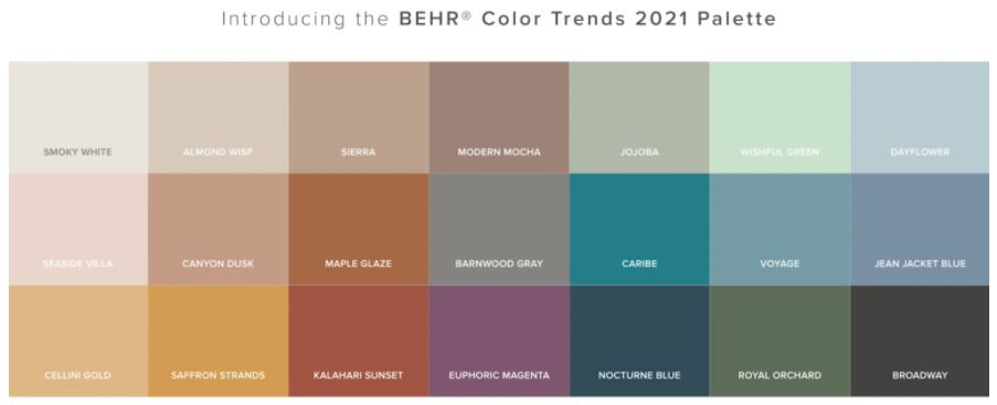
MORE COLOR PALETTE TRENDS FOR 2021
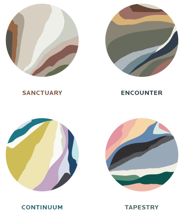
PPG COLOR FORECAST 2021
SHERWIN WILLIAMS COLOR FORECAST 2021
HOW TO USE COLOR OF THE YEAR IN YOUR HOME?
There are so many ways to use the Color of the Year or your inspired Color Palette for 2021 in your home.
If you’re shy, add just one color in anything below to freshen up your space. For the more advanced design pro, pick a color palette and layer in to a variety of elements here:
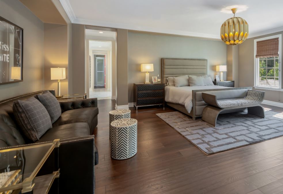
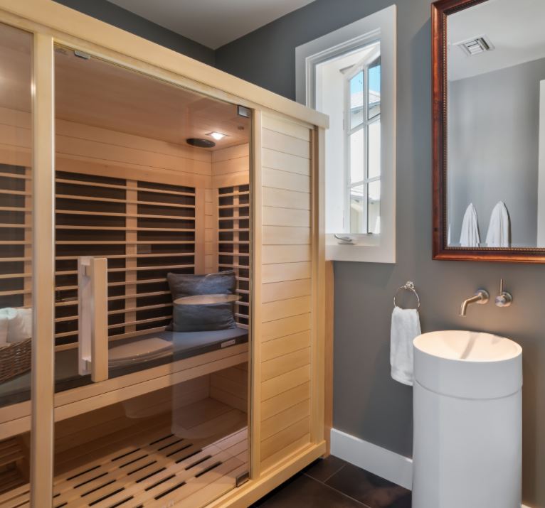
- Paint on Walls, Ceiling, Trim, or Accent Walls
- Upholstered Furniture
- Casegood Furniture, like Tables
- Cabinetry, like Kitchen, Bathroom Vanity or Built-In Bookcase
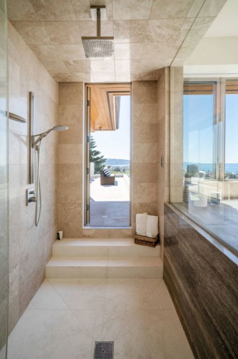
- Finish Materials like Tile, Wood, Stone or Metals
- Fixture Materials like Plumbing Hardware, Door Hardware or Lighting Fixtures
- Wallpaper
- Drapery
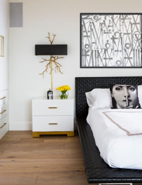
- Accents in Bedding, Pillows, Throw Blankets or Art
- Front Door
Looking for a Little Inspiration?
Check out some of our favorite past projects for ways to incorporate color into any room:
Walls
Furniture and Upholstery
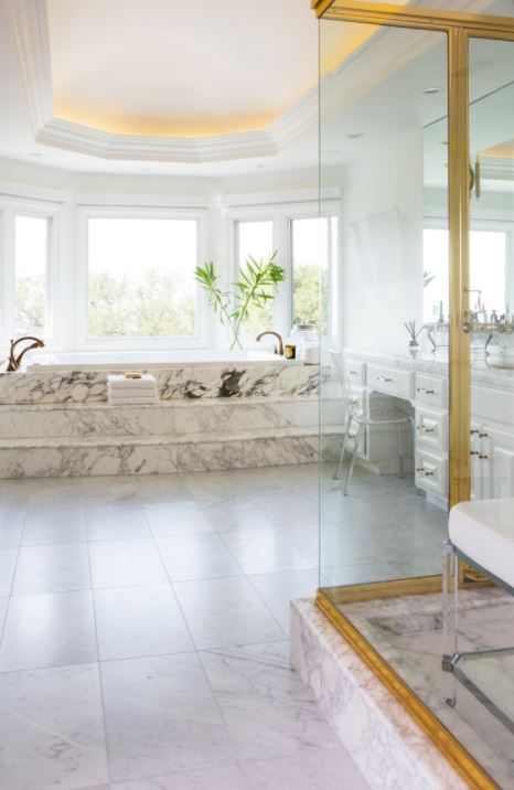
Finish Materials & Fixtures
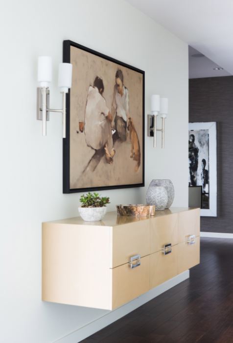
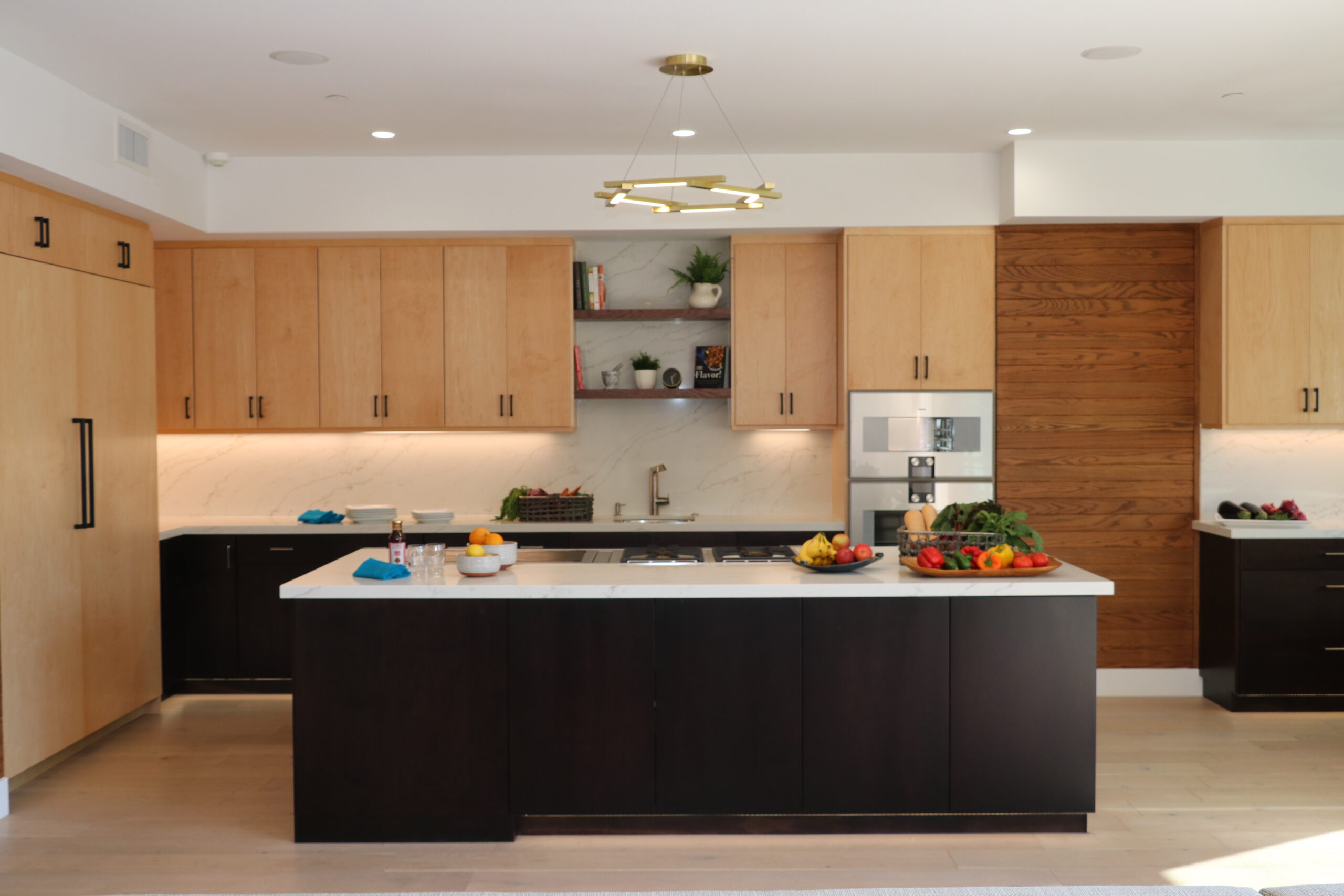
Cabinetry and Casegoods
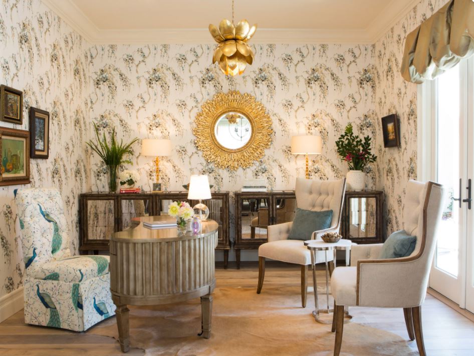
Wallpaper & Drapery
COLOR TRENDS for 2021 | by Sara Plaisted

