Hello Everyone,
This week’s question comes from Joyce Anthony. I encourage all of you to offer your feedback for Joyce in the comments section below.
In the creative process, we all learn from each other.
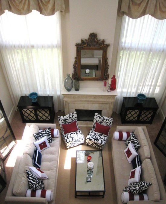
She writes, “I love the black red and white in this photo and was curious if you could tell me what the wall color is? I am doing this theme for my dining room/kitchen and am having a hard time figuring out what to paint the wall to match yet not be boring white or crazy red! Thanks so much! Joyce Anthony”
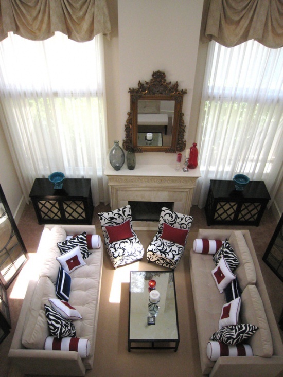
I am a big fan of white walls like the room I designed in the above photo. I find them clean and not boring at all. They work especially well when there is a lot of accent color and texture in the space.
What are your thoughts? I’m sure Joyce would love to know.
Thanks,
Lori


I like the china white, bone white and museum white.
The great thing about paint is that it’s highly variable. This looks like an off white with a warm hue added to it. Most paint shops will let you mix your own color and test it out. Just make sure and paint it on a surface and view it in both daylight and night before committing.
Hi agree that white wall are not boring. So long as you have great accents and design in other parts of the room, it can be a great choice.
White is my favorite color!
Like a wedding, the bride is wearing white, and the bridesmaides the accent colors.With the white there is less of a color argument as to what the focal features are in the room. Where to sit down and relax is the focal feature in the room, and not the walls. And I might add well done that way.
Unless you want to add an extra layer of dialog and excitement on these walls, (which might go over the top) go with white.
The room is beautiful, and I don’t think it’s possible to determine the wall color from a photo.
A great neutral complement to a black/red/white palette would be a French Gray. This is a warm, tonal gray with more brown than black, and can have a touch of red added to the mix so that it harmonizes with the accent colors on a very subtle level. The field color, or main backdrop, should not be too bright or sharp, which would create too much contrast. In order to avoid this, choose a French Gray in the mid ranges, a medium color, neither dark nor light.