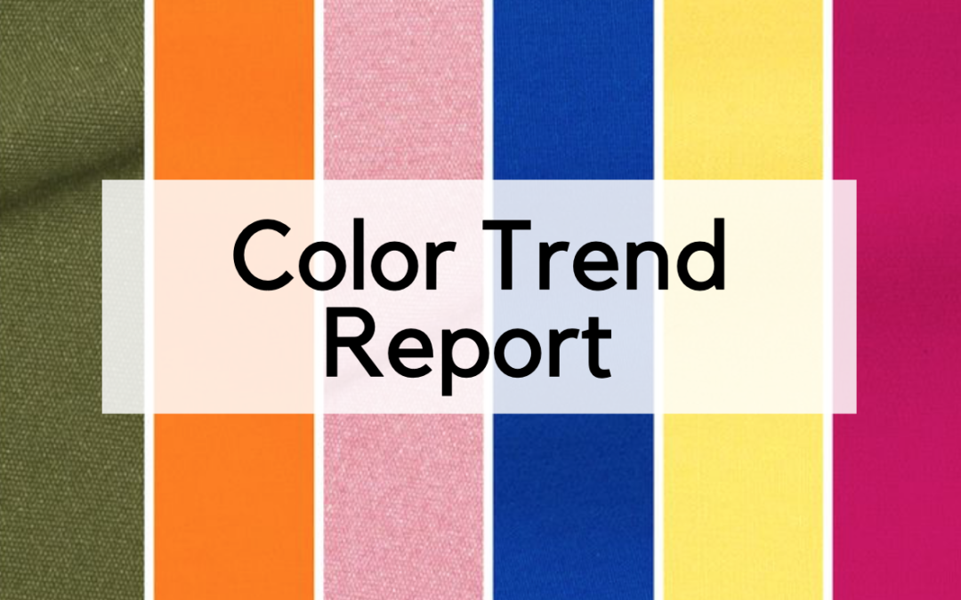
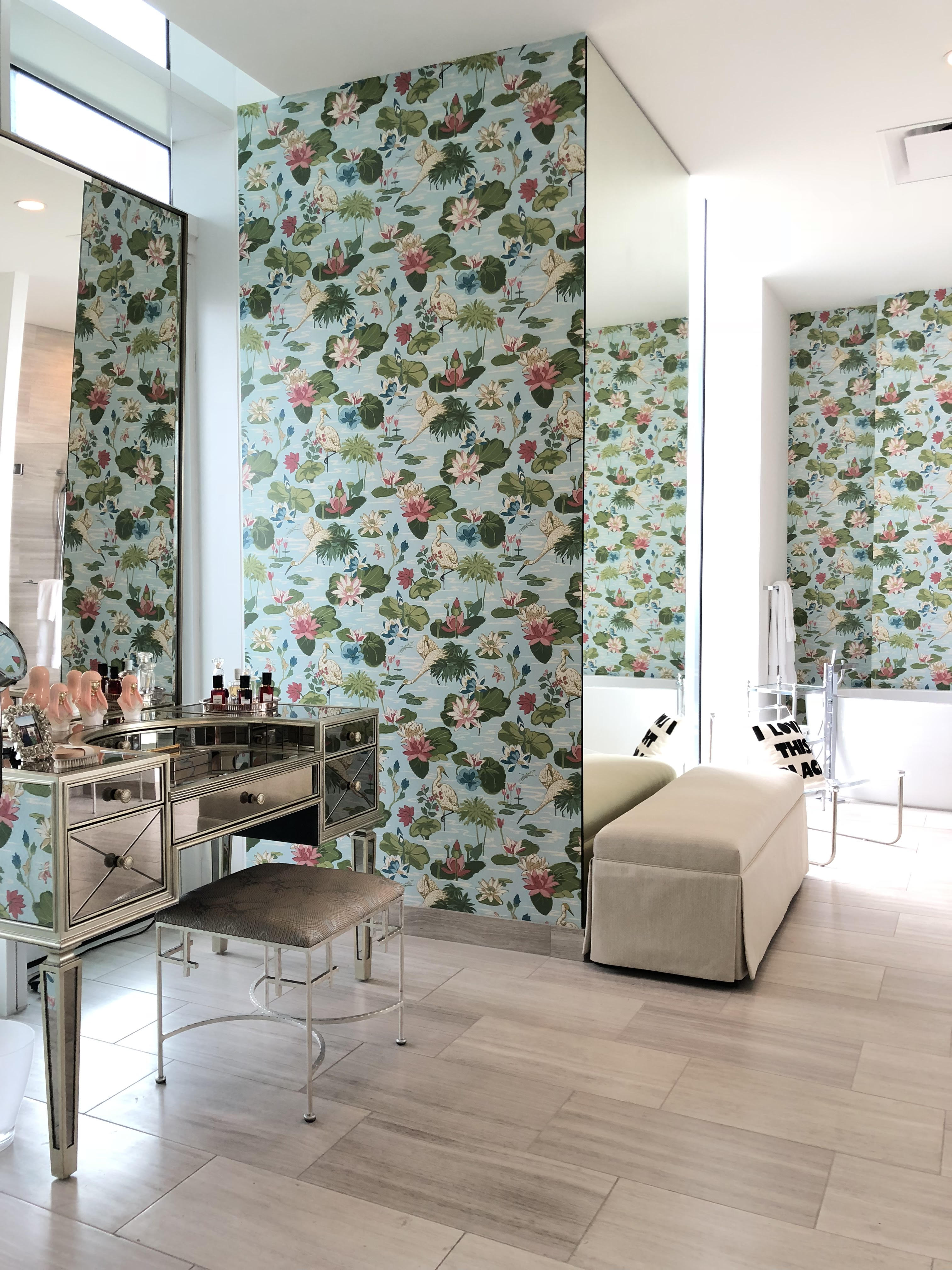
When it comes to design, we’re always thinking a season or two ahead and when we talk about current color trends, we like to take our cues from Pantone. They just released their Spring/Summer Color Trend report and this new palette is all about transcending the seasons with intense vibrant shades and invoking eclectic, retro, earthy style! Let’s take a closer look at how to use the palette in a home’s interiors:
Vibrant Maximalism in Traditional Interiors
Fiery red and orange dominante this color trend report. Which is congruous with maximalism trending upwards right now. We’re seeing an increased demand for wallpaper, traditional chintz, and chinoiserie in our projects local to Los Angeles and abroad.
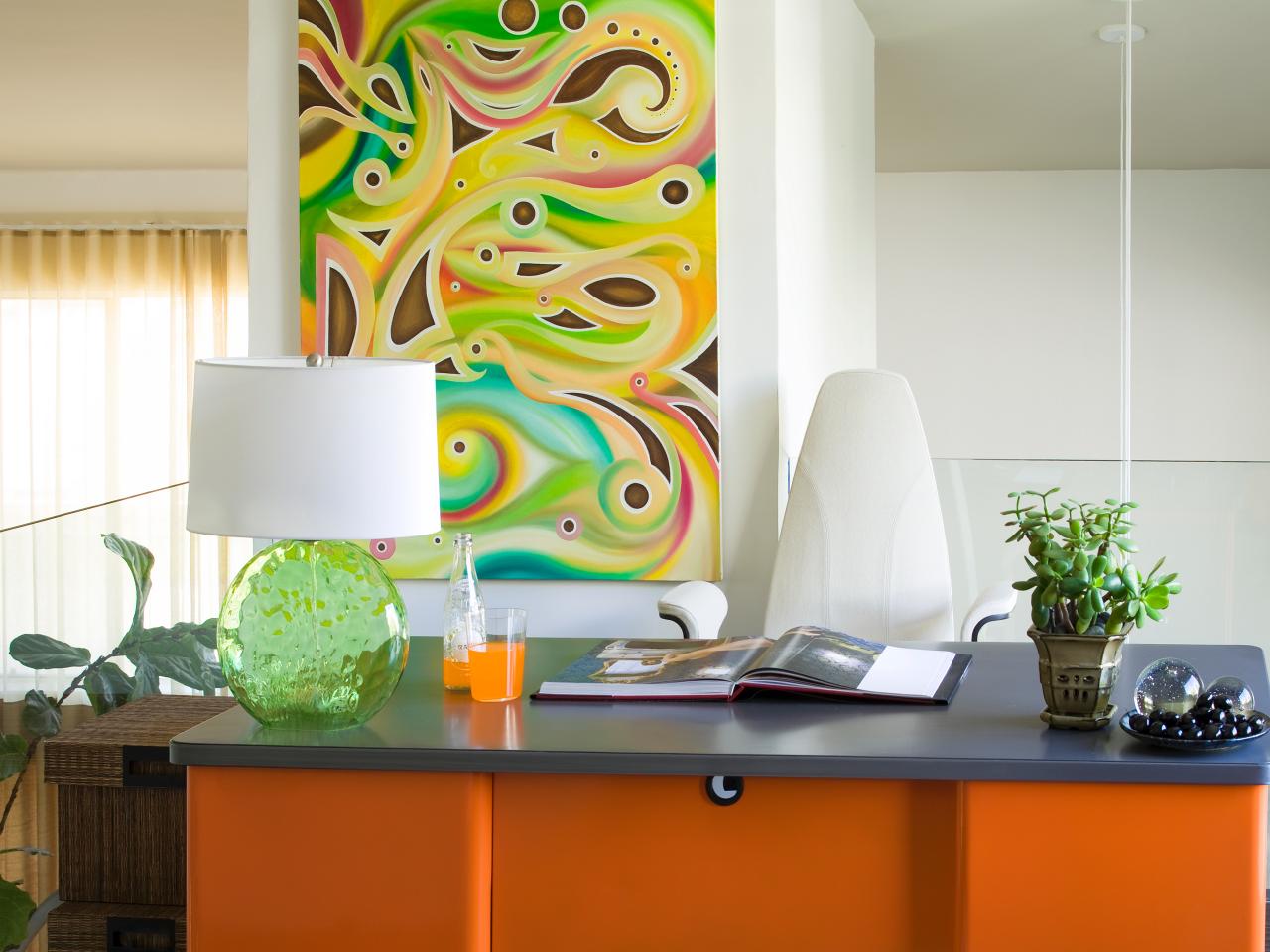
How to Use Turmeric and Jester Red in Your Home:
- Hermes, of course, is known for its iconic orange and incorporating their accessories into your decor is a great way to include some of the zesty hue
- And you can play up Jester red with kitchen accents or tone it down by pairing it with neutral shades of greys and navy.
- Make Space list Lori Dennis Inc. as Top Outdoor Interior Design Firm
How to Update Traditional Decor With Color:
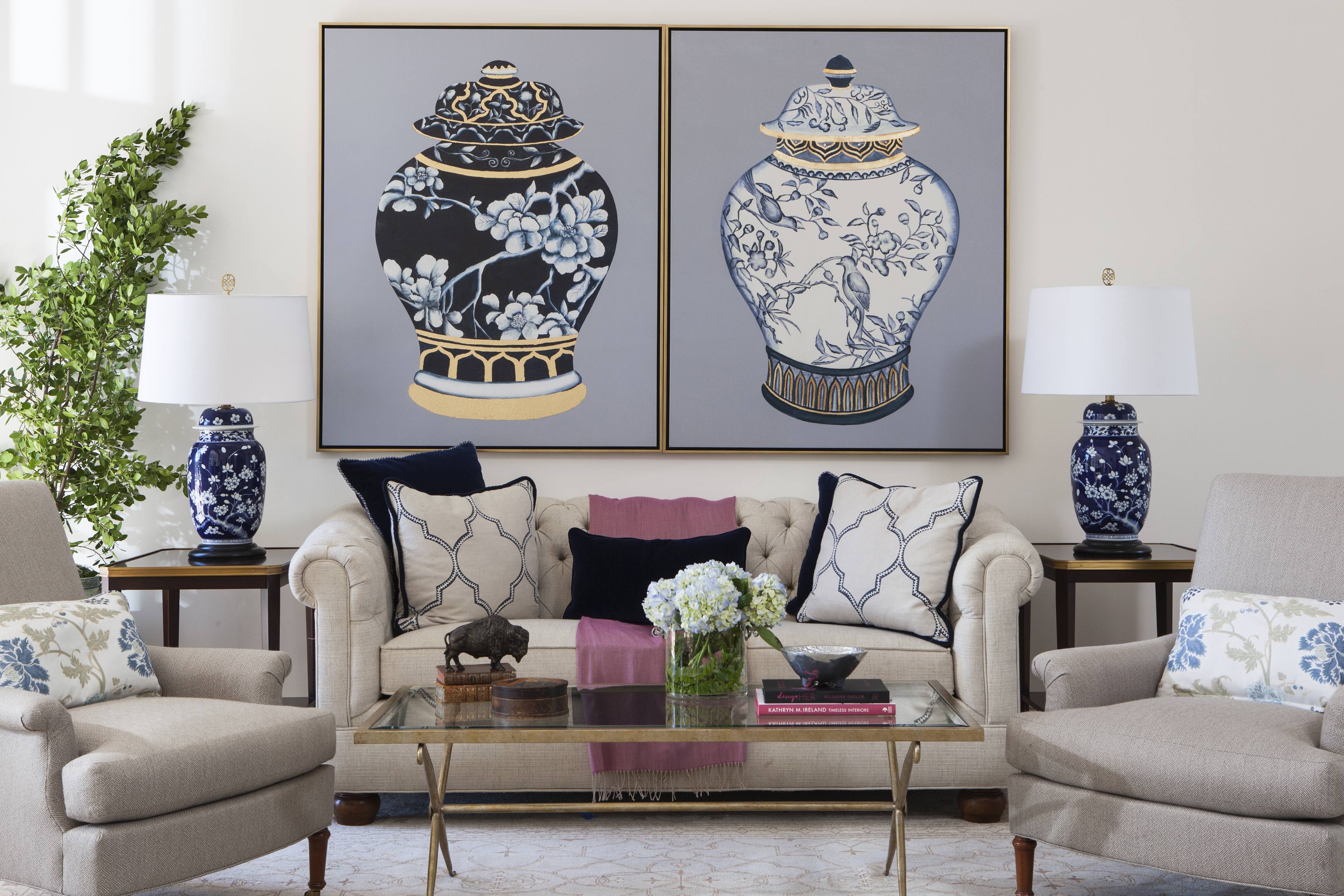
- Put a Modern Twist on Traditional Chinoiserie By Playing Around with the color ways or pairing with contemporary neutrals or industrial pieces like we did in the Lake Sherwood living room, pictured above.
Naturalistic & Eclectic
Many of colors in the palette are found in nature, but not necessarily together, implying a collected, traveled aesthetic when used simultaneously. Together pepper stem, terrarium moss, and toffee provide a soil-like base for the sweet lilac and fiesta to grow. This is a palette of an urban traveler, full of wanderlust, whose home reflects that through accumulated souvenirs or coffee table books; or perhaps it’s a sophisticated art collector whose walls are adorned in colorful paintings in an otherwise neutral environment.
- Celebrity Los Angeles Interior Designer Lori Dennis Home & Living 2007
- Celebrity Los Angeles Interior Designer Lori Dennis Contempo Homes
- Celebrity Los Angeles Interior Designer Lori Dennis Small Room Decorating Magazine
- Celebrity Los Angeles Interior Designer Lori Dennis Woman’s Day
- Celebrity Los Angeles Interior Designer Lori Dennis New York Times
- Celebrity Los Angeles Interior Designer Lori Dennis Small Room Decorating Magazine
- Celebrity Los Angeles Interior Designer Lori Dennis Smart Homeowner Magazine
How to Pull It All Together:
Wallpaper is making a huge comeback!It’s a great way to make a bold design statement and customize your space.
Large-Scale Modern Art: All that said about wallpaper…But white walls will never go out of style, especially when covered in large-scale modern art.
Coffee Table Books: Coffee table books are both beautiful and engaging accessories you can outfit your home with that add tons of personality to your space and add dimension to your large, flat surfaces.

- Make Space list Lori Dennis Inc. as Top Outdoor Interior Design Firm
Versatile Spaces
To offset the fiery hues, the new pantone palette also features a couple soft but still energetic shades of pink and yellow, reflecting the theme of versatility we’re seeing emerge in our client’s homes. Using them together says ‘this is a space for entertaining, and a space to wind down.’ Homeowners have gotten smarter. When discussing the ‘open concept’ or ‘open floor plan’ they’re discussing the idea of versatility in a space. Emphasizing the intention behind the design: Kitchens that bleed seamlessly into living rooms and great rooms emphasizing more space for entertaining.
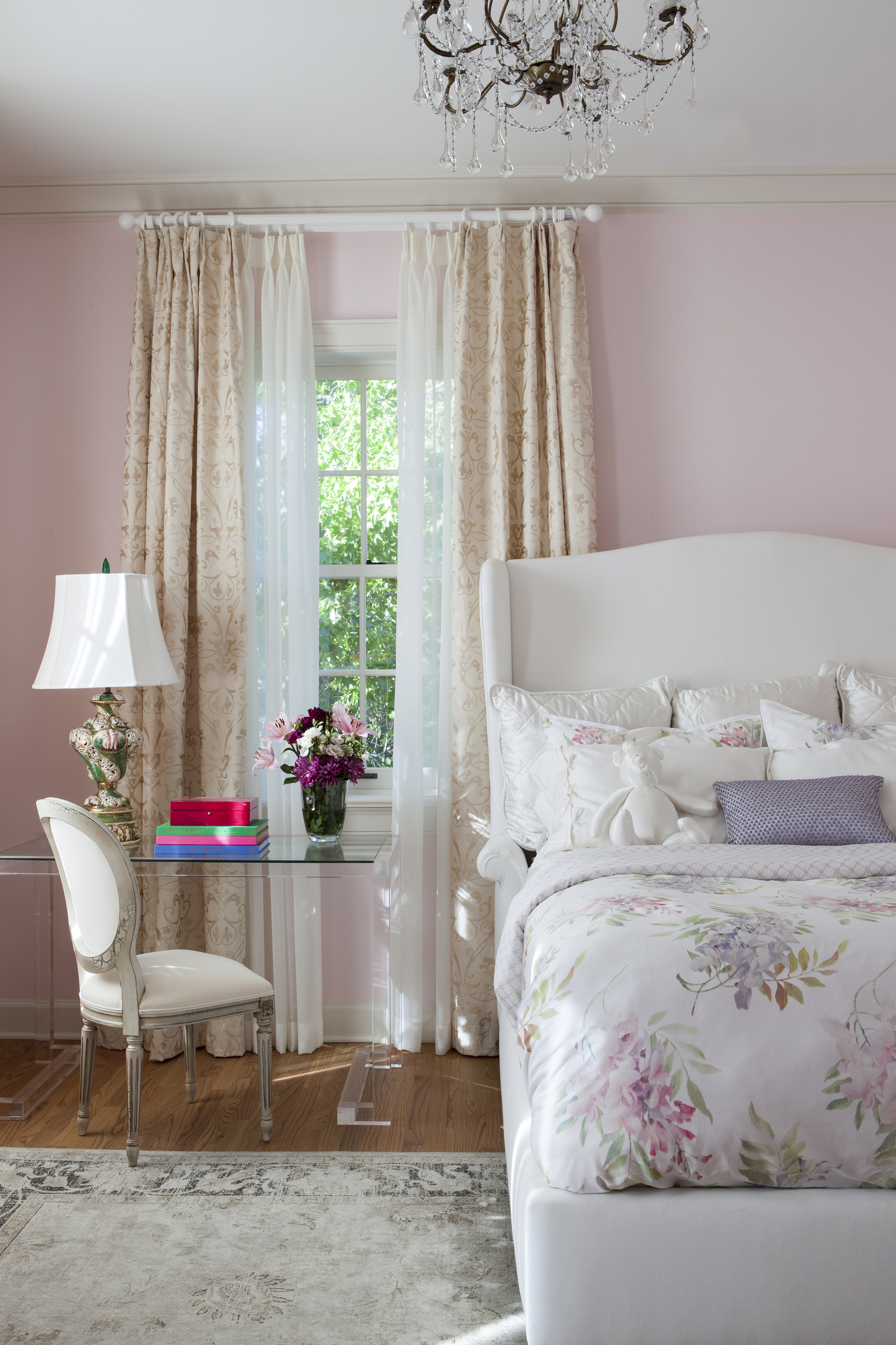
How to Use Sweet Lilac and Aspen Gold in Your Home:
- We love sweet lilac for a soft, romantic touch on bedding or lamp shades.
- And Aspen Gold and similar bouncy yellows are beautiful as floral or fruity accents in kitchens and dining rooms.

